


Published July 25, 2011
Reading time
4 minutes
4 minutes
Print
Text size
Trend Bible : Hate To Say We Told You So: Libertine
Published
July 25, 2011
July 25, 2011
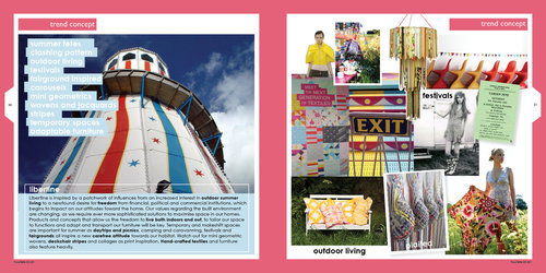
We’ve seen plenty of evidence of our Libertine trend unfolding on the UK highstreet this summer, a trend we forecast would be big news when we published our Spring Summer ’11 book back in August 2009.
Inspiration for this look began with research into how the recession was going to affect the consumer’s lifestyle choices with regards holidays and leisure time. From this research we developed a report that covered the concept of the ‘staycation’ and holidaying at home, along with affordable leisure pursuits like the good old-fashioned British beach day-trip, picnics, camping, caravanning, festivals and fetes.
 |
“Essentially we knew people were starting to cut back on their holiday spend when we began investigating this trend. Our challenge was to explore how this would impact colour and design trends for our retail clients, and help them anticipate the consumer mood and what the shopper would want to see and buy,” explains Trend Bible Creative Director Joanna Feeley.
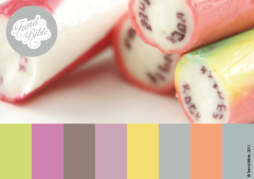 |
The colour palette for this story mixed bold acidic pastels with rock-candy pinks and these were underpinned with flat urban greys and, of course, the ubiquitous white.
Our trend researcher Victoria Buchanan has been scouting the UK highstreet for evidence of the Libertine trend, including chevron stripes, solid bold colour accessories, fairground motifs, watercolour style floral prints, powder coated metal, bunting, and spirograph geometrics. Victoria brings you this report from London, June 2011.
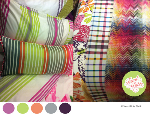 |
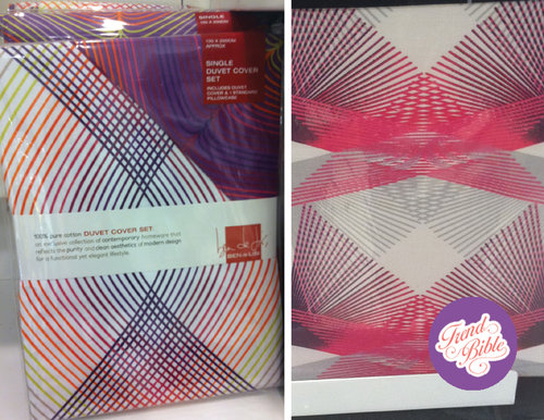
White ground colours for prints add a sharp, clean look to bold pinks and chlorophyl greens. Mixing plaids, chevrons, florals and stripes together adds personality.
 |
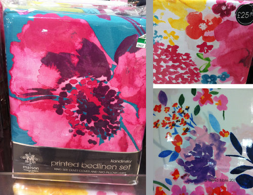 |
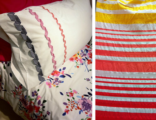
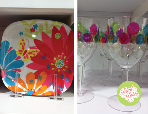
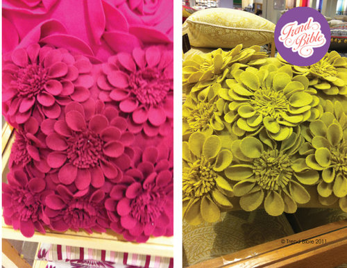
Watercolour style florals are big news for prints this summer, and feature on bedding, greeting cards, tableware and cushions. Blurred and discharge prints look great and tap into the trend for hand-painted and hand-made techniques, above.
 |
This spirograph look was big at Habitat last summer, and has now filtered through to highstreet stores like Debenhams for Summer 2011. We see this trend moving into furniture next, with strands and bands being woven and overlapped to mimic this pattern.
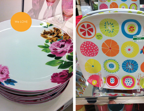 |
We love these fruity designs and anticipate fruit featuring heavily again next summer as a print motif, as the Prada and Stella McCartney catwalk collections featured an abundance of fruit imagery this summer, which filters through to home for next summer. Bold placement florals are still key for tableware, whether formal porcelain or picnic melamine.
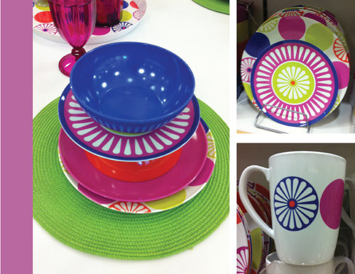 |
Pink and green are still a killer colour combination this summer, we love the shots of cobalt blue running through this 70s inspired collection, above.
 |
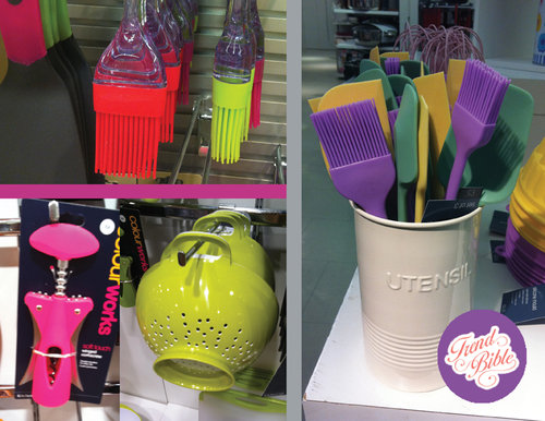 |
Kitchen and cookshop departments are still performing well as the focus is still very much on home baking and nutritional home cooked values. Colour really drives this category across silicone, melamine, and powder coated metal.
 |
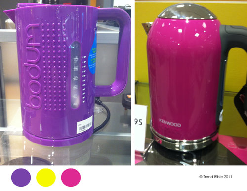 |
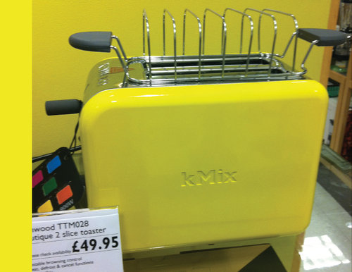
Back in 2007 we forecast the explosion that would be coloured kitchen appliances – and it’s still going strong! This summer it’s still about pink and green combos.
 |
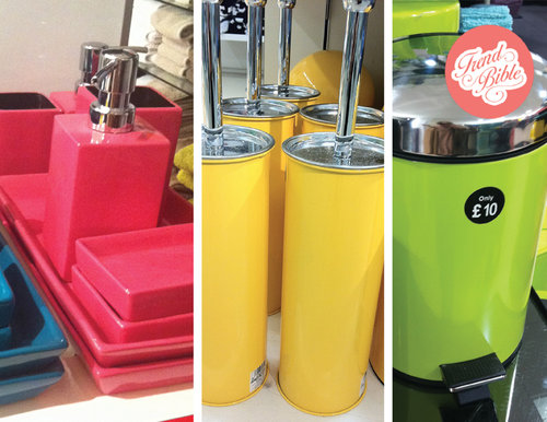 |
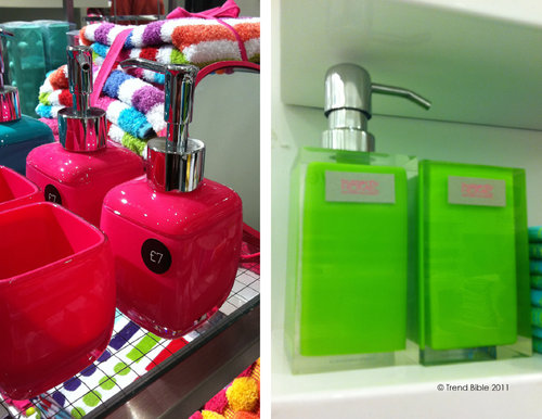
Solid colour works really well across plastic and metal accessories, above. Bathroom accessories have become a key category over the past 18 months, as people look for affordable ways to inject newness and a fresh look into their homes at an affordable price.
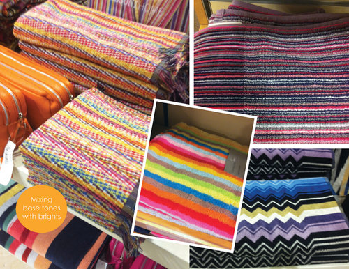 |
The patterend bath towel is well and truly back! We first spotted this trend emerging in 2008 at the Maison show n Paris, with stripe gurus Missoni leding the way with this signature look.
 |
 |
 |
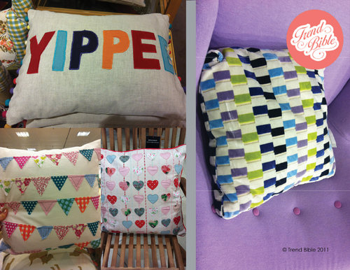
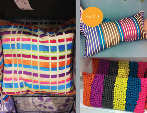
Bunting, grids, stripes and 3D effects were big news in London for cushions- this is still a statement piece for the home, an easy update and a fashion colour driver. The most common colours? You guessed it- pink and lime green!
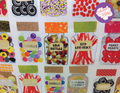 |
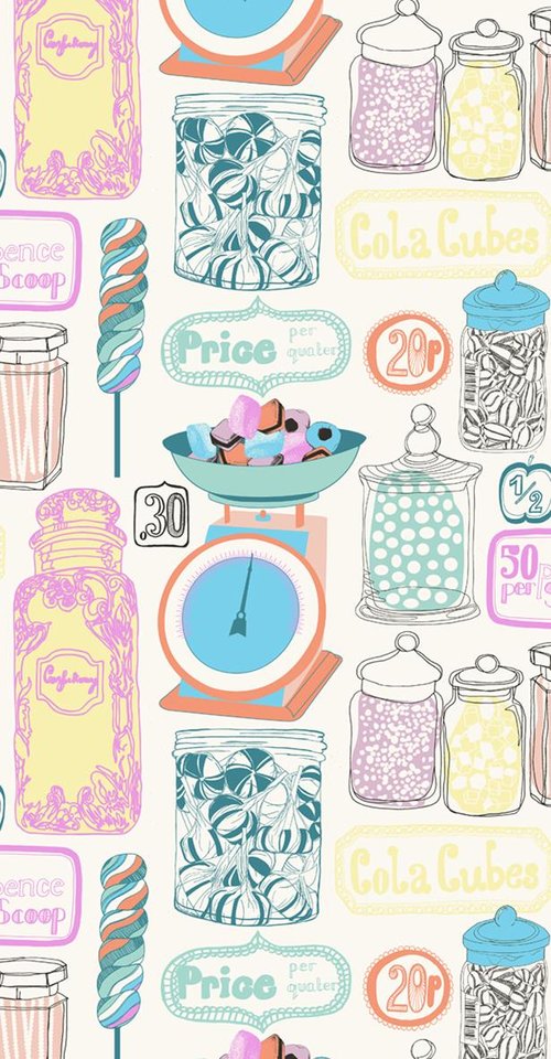
This old-fashioned sweet shop giftwrap is fun and bang on trend – but not a patch on the fantastic Sweetie wallpaper by Trend Bible favourite, Kate Usher Surfaces, below!
 |
Courtesy of Trend Bible.
Copyright © 2024 FashionNetwork.com All rights reserved.
Tags :
Industry